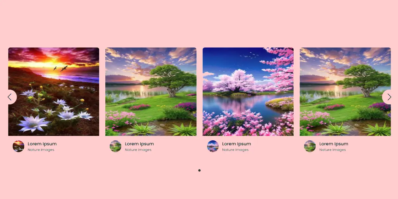
Card sliders are an essential feature for modern web applications, allowing you to display content in a dynamic and attractive manner while optimizing space. This guide will walk you through creating a responsive card slider using Swiper.js (an alternative to Owl Carousel) with a sleek PHP-backed image carousel. Let’s break it down into clear, manageable steps with PHP, HTML, CSS, and JavaScript.
Key Features of the Card Slider
- Dynamic content: PHP is used to create cards dynamically based on a range of images and profile data.
- Responsiveness: The slider adjusts seamlessly to all devices using breakpoints defined in swiper.js.
- Autoplay & Navigation: The slider supports automatic transitions and navigation controls for advanced user interactions.
- Customizable Design: Clean, modern design elements that are easily adjustable for your project.
Dynamic PHP Array for Cards
Card slider data is stored in an array, allowing you to efficiently manage the slider’s content. Here is the PHP array we use:
					<?php
$images = [
    [
        "showImg" => "images/showImg/00a3b05009b195371de8908ec175af9d.jpg",
        "profile" => "images/profile/00a3b05009b195371de8908ec175af9d.jpg",
        "name" => "Lorem Ipsum",
        "job" => "Nature Images"
    ],
    [
        "showImg" => "images/showImg/028a6fc0921f58d273130b23afd3cbb9.jpg",
        "profile" => "images/profile/028a6fc0921f58d273130b23afd3cbb9.jpg",
        "name" => "Lorem Ipsum",
        "job" => "Nature Images"
    ],
    [
        "showImg" => "images/showImg/037c6c293404dc1598e8442fed55cc06.jpg",
        "profile" => "images/profile/037c6c293404dc1598e8442fed55cc06.jpg",
        "name" => "Lorem Ipsum",
        "job" => "Nature Images"
    ],
    [
        "showImg" => "images/showImg/298e32e59deac385b7c6a97659c80190.jpg",
        "profile" => "images/profile/298e32e59deac385b7c6a97659c80190.jpg",
        "name" => "Lorem Ipsum",
        "job" => "Nature Images"
    ],
    [
        "showImg" => "images/showImg/037c6c293404dc1598e8442fed55cc06.jpg",
        "profile" => "images/profile/037c6c293404dc1598e8442fed55cc06.jpg",
        "name" => "Lorem Ipsum",
        "job" => "Nature Images"
    ]
];
?>
<!DOCTYPE html>
<html lang="en">
  <head>
    <meta charset="UTF-8" />
    <meta http-equiv="X-UA-Compatible" content="IE=edge" />
    <meta name="viewport" content="width=device-width, initial-scale=1.0" />
    <title>Card Slider HTML CSS JavaScript | CodingTutorials</title>

    <!-- Swiper CSS -->
    <link rel="stylesheet" href="css/swiper-bundle.min.css" />

    <!-- CSS -->
    <link rel="stylesheet" href="css/style.css" />
  </head>
  <body>
    <div class="container swiper">
        <div class="slide-container">
            <div class="card-wrapper swiper-wrapper">
                <?php foreach ($images as $image): ?>
                    <div class="card swiper-slide">
                        <div class="image-box">
                            <img decoding="async" src="<?= htmlspecialchars($image['showImg']); ?>" alt="" />
                        </div>
                        <div class="profile-details">
                            <img decoding="async" src="<?= htmlspecialchars($image['profile']); ?>" alt="" />
                            <div class="name-job">
                                <h3 class="name"><?= htmlspecialchars($image['name']); ?></h3>
                                <h4 class="job"><?= htmlspecialchars($image['job']); ?></h4>
                            </div>
                        </div>
                    </div>
                <?php endforeach; ?>
            </div>
        </div>
        <div class="swiper-button-next swiper-navBtn"></div>
        <div class="swiper-button-prev swiper-navBtn"></div>
        <div class="swiper-pagination"></div>
    </div>

    <script src="js/swiper-bundle.min.js"></script>
    <script src="js/script.js"></script>
  </body>
</html>
The PHP script dynamically generates the slider’s cards within the swiper-wrapper container.
Each card is wrapped in a swiper-slide class to integrate seamlessly with Swiper.js functionality.
CSS Styling
The appearance of the slider has been enhanced using the following CSS. It includes modern styles like rounded corners and responsive layout:
Making It Responsive
Responsive design is essential to ensure that the slider looks good on all devices. Adjust the layout for smaller screens, using CSS media queries. Swiper.js breakpoint feature helps configure which slides appear per screen width.
					/* Google Fonts - Poppins */
@import url("https://fonts.googleapis.com/css2?family=Poppins:wght@300;400;500;600&display=swap");

* {
  margin: 0;
  padding: 0;
  box-sizing: border-box;
  font-family: "Poppins", sans-serif;
}
body {
  min-height: 100vh;
  display: flex;
  align-items: center;
  justify-content: center;
  background: #efefef;
}
.container {
  max-width: 1400px;
  width: 100%;
  padding: 60px 0;
}
.slide-container {
  margin: 0 30px;
  overflow: hidden;
}
.card {
  background: #fff;
  border-radius: 8px;
}
.card .image-box {
  height: 300px;
}
.card .image-box img {
  width: 100%;
  height: 100%;
  border-radius: 8px 8px 0 0;
}
.card .profile-details {
  display: flex;
  align-items: center;
  column-gap: 12px;
  padding: 15px;
}
.card .profile-details img {
  height: 40px;
  width: 40px;
  border-radius: 50%;
}
.profile-details .name {
  font-size: 15px;
  font-weight: 500;
}
.profile-details .job {
  font-size: 12px;
  font-weight: 500;
  color: #4d4d4d;
}

.swiper-navBtn {
  color: #000;
  height: 50px;
  width: 50px;
  transform: translateY(-40%);
  background: #fff;
  border-radius: 50%;
}
.swiper-navBtn::before,
.swiper-navBtn::after {
  font-size: 24px;
}

.swiper-pagination-bullet {
  background-color: #333;
}

@media screen and (max-width: 768px) {
  .swiper-navBtn {
    display: none;
  }
}
JavaScript for Swiper.js
Use the following script to enable script.js functionality:
Responsive design is essential to ensure that the slider looks good on all devices. Adjust the layout for smaller screens, using CSS media queries. Swiper.js breakpoint feature helps configure which slides appear per screen width.
Why Choose Swiper.js Over Owl Carousel?
- Customization: Script.js offers a wide range of options, from pagination styles to dynamic slide adjustments.
- Performance: Lightweight and optimized for performance.
- Responsiveness: Built-in support for mobile-friendly designs without additional CSS tweaks.
- Modern Features: Includes touch gestures, lazy loading, and CSS-mode sliders.
					var swiper = new Swiper(".slide-container", {
  slidesPerView: 4,
  spaceBetween: 20,
  sliderPerGroup: 4,
  loop: true,
  centerSlide: "true",
  fade: "true",
  grabCursor: "true",
  pagination: {
    el: ".swiper-pagination",
    clickable: true,
    dynamicBullets: true,
  },
  navigation: {
    nextEl: ".swiper-button-next",
    prevEl: ".swiper-button-prev",
  },
    autoplay: {
        delay: 3000,
        disableOnInteraction: false,
      },
      direction: "horizontal",
  breakpoints: {
    0: {
      slidesPerView: 1,
    },
    520: {
      slidesPerView: 2,
    },
    768: {
      slidesPerView: 3,
    },
    1000: {
      slidesPerView: 4,
    },
  },
});
Conclusion
The use of Poppins and Swiper.js ensures that your website has a clean, professional appearance while providing smooth functionality. This setup is perfect for displaying image galleries, portfolios, or testimonials. With responsive design, it provides a user-friendly experience on any device.
Responsive Owl Carousel Card Slider
Send download link to:


