Creating a Responsive Social Media Card Design Using HTML and CSS
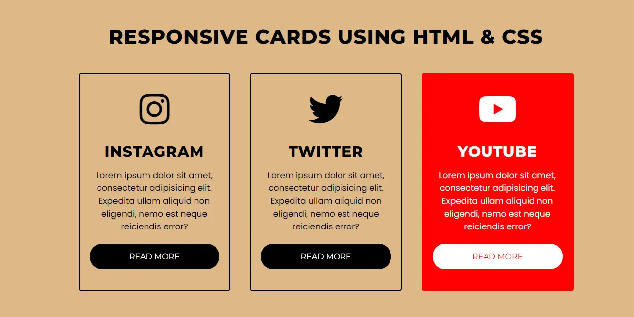
Social media responsive card design is a popular web design trend that effectively displays concise information with eye-catching elements. These cards are especially useful for showcasing social media profiles, articles or services. In this guide, we’ll learn how to create a responsive social media card design using HTML and CSS.
Create HTML Structure
The HTML structure of our design is simple and organized. Each card will represent a social media platform (Instagram, Twitter, YouTube) and include an icon, title, description, and a “Read More” button.
Create index.php file
					<!DOCTYPE html>
<html lang="en" dir="ltr">
   <head>
      <meta charset="utf-8">
       <title>Responsive Cards</title>
      <link rel="stylesheet" href="style.css">

      <meta name="viewport" content="width=device-width, initial-scale=1.0">
   </head>
   <body>
      <div class="cards">
         <h2 class="header">
            Responsive Cards using HTML & CSS
         </h2>
         <div class="services">

            <div class="content content-2">
               <div class="fab fa-instagram"></div>
               <h2>
                  Instagram
               </h2>
               <p>
                  Lorem ipsum dolor sit amet, consectetur adipisicing elit. Expedita ullam aliquid non eligendi, nemo est neque reiciendis error?
               </p>
               <a href="#">Read More</a>
            </div>
             <div class="content content-1">
               <div class="fab fa-twitter"></div>
               <h2>
                  Twitter
               </h2>
               <p>
                  Lorem ipsum dolor sit amet, consectetur adipisicing elit. Expedita ullam aliquid non eligendi, nemo est neque reiciendis error?
               </p>
               <a href="#">Read More</a>
            </div>
            <div class="content content-3">
               <div class="fab fa-youtube"></div>
               <h2>
                  Youtube
               </h2>
               <p>
                  Lorem ipsum dolor sit amet, consectetur adipisicing elit. Expedita ullam aliquid non eligendi, nemo est neque reiciendis error?
               </p>
               <a href="#">Read More</a>
            </div>
         </div>
      </div>
   </body>
</html>
This structure organizes cards inside a .services container, with each card given a content class. The cards are styled with additional specific classes like content-1, content-2, etc., for unique hover effects.
Create CSS Styling
In the style.css file, We style the cards and make them responsive. Here’s a detailed look:
Create style.css file
					@import url('https://fonts.googleapis.com/css?family=Montserrat:400,800|Poppins&display=swap');
*{
  margin: 0;
  padding: 0;
  box-sizing: border-box;
  font-family: 'Montserrat',sans-serif;
}
body{
    background-color: burlywood;
}
.cards{
  max-width: 1100px;
  margin: 0 auto;
  text-align: center;
  padding: 30px;
}
.cards h2.header{
  font-size: 40px;
  margin: 0 0 30px 0;
  text-transform: uppercase;
  letter-spacing: 1px;
}
.services{
  display: flex;
  align-items: center;
}
.content{
  display: flex;
  flex-wrap: wrap;
  flex: 1;
  margin: 20px;
  padding: 20px;
  border: 2px solid black;
  border-radius: 4px;
  transition: all .3s ease;
}
.content .fab{
  font-size: 70px;
  margin: 16px 0;
}
.content > *{
  flex: 1 1 100%;
}
.content:hover{
  color: white;
}
.content:hover a{
  border-color: white;
  background: white;
}
.content-1:hover{
  border-color: #1DA1F2;
  background: #1DA1F2;
}
.content-1:hover a{
  color: #1DA1F2;
}
.content-2:hover{
  border-color: #E1306C;
  background: #E1306C;
}
.content-2:hover a{
  color: #E1306C;
}
.content-3:hover{
  border-color: #ff0000;
  background: #ff0000;
}
.content-3:hover a{
  color: #ff0000;
}
.content h2{
  font-size: 30px;
  margin: 16px 0;
  letter-spacing: 1px;
  text-transform: uppercase;
}
.content p{
  font-size: 17px;
  font-family: 'Poppins',sans-serif;
}
.content a{
  margin: 22px 0;
  background: black;
  color: white;
  text-decoration: none;
  text-transform: uppercase;
  border: 1px solid black;
  padding: 15px 0;
  border-radius: 25px;
  transition: .3s ease;
}
.content a:hover{
  border-radius: 4px;
}
@media (max-width: 900px) {
  .services{
    display: flex;
    flex-direction: column;
  }
}
The Montserrat and Poppins fonts are used for a modern, clean aesthetic.
Card Container
The .cards class defines the container, while .header styles the main heading.
Flexbox Layout for Cards
Flexbox ensures proper alignment of the cards. flex-wrap enables wrapping for responsiveness.
Card Content
Icons are styled using Font Awesome, and hover effects change the text color.
Hover Effects and Colors
Each card gets a unique hover color that matches the brand colors of the respective social media platform.
Responsive Design
This media query ensures the cards stack vertically on smaller screens, maintaining usability.
How It Works
- Icon and Content: Each card includes an icon, title, description, and button. The icons use Font Awesome for scalability and consistent styling.
- Hover Effects: Unique hover effects are applied to enhance interactivity. Background, border, and button colors change to create a dynamic user experience.
- Responsiveness: Flexbox ensures that the cards are compatible with different screen sizes. Media queries ensure proper stacking on mobile devices.
Further Customizations
You can easily expand this design by:
- Adding more cards for additional social media platforms.
- Including animations (e.g., using
@keyframes) for hover effects. - Adding links to actual social media profiles or pages.
Conclusion
Responsive social media card design showcases the versatility of HTML and CSS. This approach provides a modern and user-friendly way of displaying information. By understanding structure and styling, you can adapt and scale this design for different use cases.

