Create login and registration forms in HTML and JavaScript
If you are web developer and want to create login and registration forms but you don’t know and don’t get any idea then you can copy this code and paste it on your code editor, here I am adding all the code which you will need. This will help you create sign in forms and complete login forms with a single click.
In this blog post, I will guide you through the process of creating a responsive website with login and registration forms using HTML, CSS, and JavaScript. By completing this project, you will gain practical experience and learn essential web development concepts such as DOM manipulation, event handling, conditional statements and more.
The navigation bar and forms of the website are fully responsive. On smaller screens, clicking the hamburger button will pop up the navigation bar on the right and keep the left image section of the form hidden.
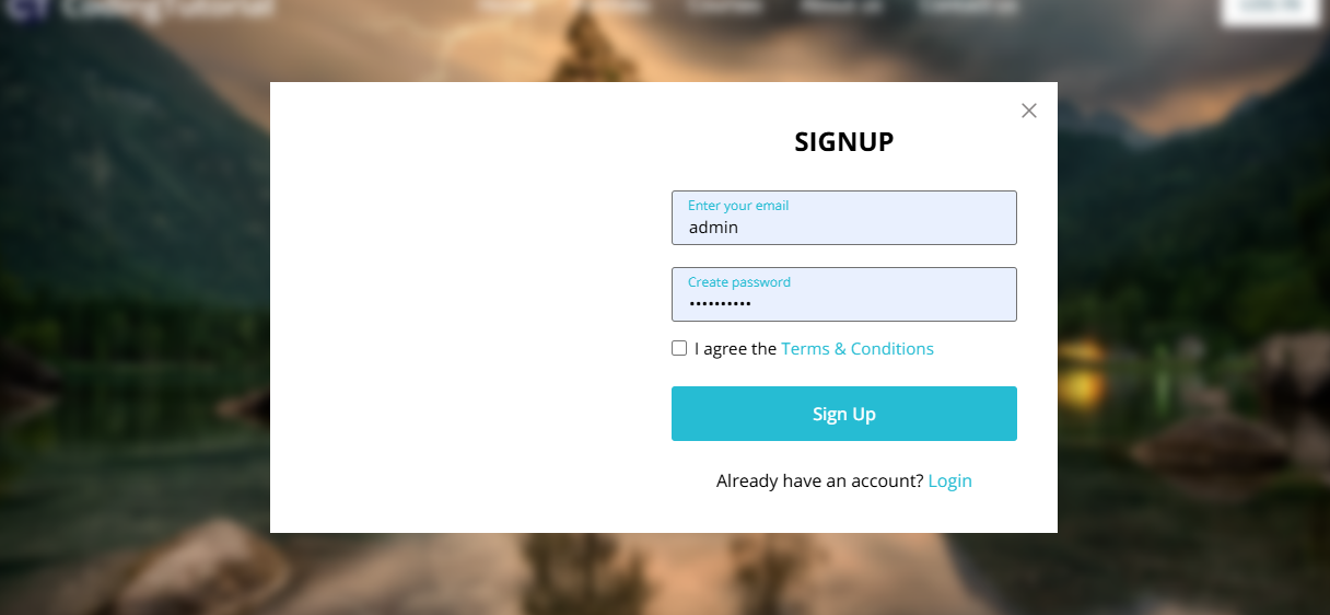
Create a website with login and registration form
Create a responsive website with login and registration forms using HTML, CSS and vanilla JavaScript, follow these simple step-by-step instructions:
The code includes a click event listener that can toggle classes on different HTML elements. Although the code is simple and easy to understand, it is recommended that you watch the video instructions above, read the code comments, and experiment with it to gain a better understanding.
					<!DOCTYPE html>
<html lang="en">
<head>
    <meta charset="UTF-8">
    <meta name="viewport" content="width=device-width, initial-scale=1.0">
    <title>Website with Login and Registration Form | CodingTutorials</title>
    <!-- Google Fonts Link For Icons -->


    <script type="rocketlazyloadscript" src="script.js" defer></script>
</head>
<body>
    <header>
        <nav class="navbar">
            <span class="hamburger-btn material-symbols-rounded">menu</span>
            <a href="#" class="logo">
                <img decoding="async" src="data:image/svg+xml,%3Csvg%20xmlns='http://www.w3.org/2000/svg'%20viewBox='0%200%200%200'%3E%3C/svg%3E" alt="logo" data-lazy-src="images/cropped-Your-paragraph-text-1-2.png"><noscript><img decoding="async" src="images/cropped-Your-paragraph-text-1-2.png" alt="logo"></noscript>
                <h2>CodingTutorials</h2>
            </a>
            <ul class="links">
                <span class="close-btn material-symbols-rounded">close</span>
                <li><a href="#">Home</a></li>
                <li><a href="#">Portfolio</a></li>
                <li><a href="#">Courses</a></li>
                <li><a href="#">About us</a></li>
                <li><a href="#">Contact us</a></li>
            </ul>
            <button class="login-btn">LOG IN</button>
        </nav>
    </header>

    <div class="blur-bg-overlay"></div>
    <div class="form-popup">
        <span class="close-btn material-symbols-rounded">close</span>
        <div class="form-box login">
            <div class="form-details">
                <h2>Welcome Back</h2>
                <p>Please log in using your personal information to stay connected with us.</p>
            </div>
            <div class="form-content">
                <h2>LOGIN</h2>
                <form action="#">
                    <div class="input-field">
                        <input type="text" required>
                        <label>Email</label>
                    </div>
                    <div class="input-field">
                        <input type="password" required>
                        <label>Password</label>
                    </div>
                    <a href="#" class="forgot-pass-link">Forgot password?</a>
                    <button type="submit">Log In</button>
                </form>
                <div class="bottom-link">
                    Don't have an account?
                    <a href="#" id="signup-link">Signup</a>
                </div>
            </div>
        </div>
        <div class="form-box signup">
            <div class="form-details">
                <h2>Create Account</h2>
                <p>To become a part of our community, please sign up using your personal information.</p>
            </div>
            <div class="form-content">
                <h2>SIGNUP</h2>
                <form action="#">
                    <div class="input-field">
                        <input type="text" required>
                        <label>Enter your email</label>
                    </div>
                    <div class="input-field">
                        <input type="password" required>
                        <label>Create password</label>
                    </div>
                    <div class="policy-text">
                        <input type="checkbox" id="policy">
                        <label for="policy">
                            I agree the
                            <a href="#" class="option">Terms & Conditions</a>
                        </label>
                    </div>
                    <button type="submit">Sign Up</button>
                </form>
                <div class="bottom-link">
                    Already have an account?
                    <a href="#" id="login-link">Login</a>
                </div>
            </div>
        </div>
    </div>
    <!-- Coding By CodingTutorials - www.codingtutorials.in -->
</body>
</html>
- First, create a folder with your preferred name and then, create the required files inside it.
- Create a file called Index.html to serve as the main file.
- Create style.css file under this folder or create new folder and add style.css file.
- Create a file called script.js to hold the JavaScript code.
- Finally, download the Images folder and save it in your project directory. This folder contains all the images you will need for this project.
To get started, add the following HTML code to your Index.html file. These codes contain all the necessary HTML elements for the project, like header, nav, ul, form and more.
Next, add the following CSS code to your style.css file to apply the visual style to your website and form. You can experiment with different CSS properties like color, font and background to give a unique touch to your website.
					@import url("https://fonts.googleapis.com/css2?family=Open+Sans:wght@400;500;600;700&display=swap");

* {
    margin: 0;
    padding: 0;
    box-sizing: border-box;
    font-family: "Open Sans", sans-serif;
}

body {
    height: 100vh;
    width: 100%;
    background: url("images/nature-3082832_1280.jpg") center/cover no-repeat;
}

header {
    position: fixed;
    width: 100%;
    top: 0;
    left: 0;
    z-index: 10;
    padding: 0 10px;
}

.navbar {
    display: flex;
    padding: 22px 0;
    align-items: center;
    max-width: 1200px;
    margin: 0 auto;
    justify-content: space-between;
}

.navbar .hamburger-btn {
    display: none;
    color: #fff;
    cursor: pointer;
    font-size: 1.5rem;
}

.navbar .logo {
    gap: 10px;
    display: flex;
    align-items: center;
    text-decoration: none;
}

.navbar .logo img {
    width: 40px;
    border-radius: 50%;
}

.navbar .logo h2 {
    color: #fff;
    font-weight: 600;
    font-size: 1.7rem;
}

.navbar .links {
    display: flex;
    gap: 35px;
    list-style: none;
    align-items: center;
}

.navbar .close-btn {
    position: absolute;
    right: 20px;
    top: 20px;
    display: none;
    color: #000;
    cursor: pointer;
}

.navbar .links a {
    color: #fff;
    font-size: 1.1rem;
    font-weight: 500;
    text-decoration: none;
    transition: 0.1s ease;
}

.navbar .links a:hover {
    color: #19e8ff;
}

.navbar .login-btn {
    border: none;
    outline: none;
    background: #fff;
    color: #275360;
    font-size: 1rem;
    font-weight: 600;
    padding: 10px 18px;
    border-radius: 3px;
    cursor: pointer;
    transition: 0.15s ease;
}

.navbar .login-btn:hover {
    background: #ddd;
}

.form-popup {
    position: fixed;
    top: 50%;
    left: 50%;
    z-index: 10;
    width: 100%;
    opacity: 0;
    pointer-events: none;
    max-width: 720px;
    background: #fff;
    border: 2px solid #fff;
    transform: translate(-50%, -70%);
}

.show-popup .form-popup {
    opacity: 1;
    pointer-events: auto;
    transform: translate(-50%, -50%);
    transition: transform 0.3s ease, opacity 0.1s;
}

.form-popup .close-btn {
    position: absolute;
    top: 12px;
    right: 12px;
    color: #878484;
    cursor: pointer;
}

.blur-bg-overlay {
    position: fixed;
    top: 0;
    left: 0;
    z-index: 10;
    height: 100%;
    width: 100%;
    opacity: 0;
    pointer-events: none;
    backdrop-filter: blur(5px);
    -webkit-backdrop-filter: blur(5px);
    transition: 0.1s ease;
}

.show-popup .blur-bg-overlay {
    opacity: 1;
    pointer-events: auto;
}

.form-popup .form-box {
    display: flex;
}

.form-box .form-details {
    width: 100%;
    color: #fff;
    max-width: 330px;
    text-align: center;
    display: flex;
    flex-direction: column;
    justify-content: center;
    align-items: center;
}

.login .form-details {
    padding: 0 40px;
    background: url("https://media.istockphoto.com/id/1356364287/photo/close-up-focus-on-persons-hands-typing-on-the-desktop-computer-backlit-keyboard-screens-show.jpg?s=612x612&w=0&k=20&c=ijjq-DLNxIaPuGvIX8k06IZxMAjGpyJeboaV_byCX9k=");
    background-position: center;
    background-size: cover;
}

.signup .form-details {
    padding: 0 20px;
    background: url("images/signup-img.jpg");
    background-position: center;
    background-size: cover;
}

.form-box .form-content {
    width: 100%;
    padding: 35px;
}

.form-box h2 {
    text-align: center;
    margin-bottom: 29px;
}

form .input-field {
    position: relative;
    height: 50px;
    width: 100%;
    margin-top: 20px;
}

.input-field input {
    height: 100%;
    width: 100%;
    background: none;
    outline: none;
    font-size: 0.95rem;
    padding: 0 15px;
    border: 1px solid #717171;
    border-radius: 3px;
}

.input-field input:focus {
    border: 1px solid #00bcd4;
}

.input-field label {
    position: absolute;
    top: 50%;
    left: 15px;
    transform: translateY(-50%);
    color: #4a4646;
    pointer-events: none;
    transition: 0.2s ease;
}

.input-field input:is(:focus, :valid) {
    padding: 16px 15px 0;
}

.input-field input:is(:focus, :valid)~label {
    transform: translateY(-120%);
    color: #00bcd4;
    font-size: 0.75rem;
}

.form-box a {
    color: #00bcd4;
    text-decoration: none;
}

.form-box a:hover {
    text-decoration: underline;
}

form :where(.forgot-pass-link, .policy-text) {
    display: inline-flex;
    margin-top: 13px;
    font-size: 0.95rem;
}

form button {
    width: 100%;
    color: #fff;
    border: none;
    outline: none;
    padding: 14px 0;
    font-size: 1rem;
    font-weight: 500;
    border-radius: 3px;
    cursor: pointer;
    margin: 25px 0;
    background: #00bcd4;
    transition: 0.2s ease;
}

form button:hover {
    background: #0097a7;
}

.form-content .bottom-link {
    text-align: center;
}

.form-popup .signup,
.form-popup.show-signup .login {
    display: none;
}

.form-popup.show-signup .signup {
    display: flex;
}

.signup .policy-text {
    display: flex;
    margin-top: 14px;
    align-items: center;
}

.signup .policy-text input {
    width: 14px;
    height: 14px;
    margin-right: 7px;
}

@media (max-width: 950px) {
    .navbar :is(.hamburger-btn, .close-btn) {
        display: block;
    }

    .navbar {
        padding: 15px 0;
    }

    .navbar .logo img {
        display: none;
    }

    .navbar .logo h2 {
        font-size: 1.4rem;
    }

    .navbar .links {
        position: fixed;
        top: 0;
        z-index: 10;
        left: -100%;
        display: block;
        height: 100vh;
        width: 100%;
        padding-top: 60px;
        text-align: center;
        background: #fff;
        transition: 0.2s ease;
    }

    .navbar .links.show-menu {
        left: 0;
    }

    .navbar .links a {
        display: inline-flex;
        margin: 20px 0;
        font-size: 1.2rem;
        color: #000;
    }

    .navbar .links a:hover {
        color: #00BCD4;
    }

    .navbar .login-btn {
        font-size: 0.9rem;
        padding: 7px 10px;
    }
}

@media (max-width: 760px) {
    .form-popup {
        width: 95%;
    }

    .form-box .form-details {
        display: none;
    }

    .form-box .form-content {
        padding: 30px 20px;
    }
}
After applying the styles, load webpage in your browser to view your website. The forms are hidden for now and will only be visible later using JavaScript. Now, you will see the website with only the navigation bar and hero image.
The code includes click event listeners that can toggle classes on various HTML elements. Although the code is simple and easy to comprehend, it is recommended that you watch the video instruction above, read the code comments, and experiment with it to gain a better understanding.
					const navbarMenu = document.querySelector(".navbar .links");
const hamburgerBtn = document.querySelector(".hamburger-btn");
const hideMenuBtn = navbarMenu.querySelector(".close-btn");
const showPopupBtn = document.querySelector(".login-btn");
const formPopup = document.querySelector(".form-popup");
const hidePopupBtn = formPopup.querySelector(".close-btn");
const signupLoginLink = formPopup.querySelectorAll(".bottom-link a");

// Show mobile menu
hamburgerBtn.addEventListener("click", () => {
    navbarMenu.classList.toggle("show-menu");
});

// Hide mobile menu
hideMenuBtn.addEventListener("click", () =>  hamburgerBtn.click());

// Show login popup
showPopupBtn.addEventListener("click", () => {
    document.body.classList.toggle("show-popup");
});

// Hide login popup
hidePopupBtn.addEventListener("click", () => showPopupBtn.click());

// Show or hide signup form
signupLoginLink.forEach(link => {
    link.addEventListener("click", (e) => {
        e.preventDefault();
        formPopup.classList[link.id === 'signup-link' ? 'add' : 'remove']("show-signup");
    });
});
Conclusion and Final words
Ultimately, creating a website homepage that includes forms is a hands-on experience in learning various website components and fundamental web development concepts.I believe that by following the steps mentioned in this blog post, you have successfully created your website with login and registration forms using HTML, CSS and JavaScript.
To further improve your web development skills, I suggest you try to recreate other websites and login form projects available on this website. This will give you a better understanding of how HTML, CSS, and JavaScript are used to create unique website components.
If you encounter any problems while building your website with forms, you can download the source code files for this project for free by clicking the download button. You can also watch its live demo by clicking on the View Live button.
Download Source Code
Send download link to: