Hello, my friends today I am going to create a Custom Animated Alert Box and Pop-up modal using HTML and CSS. In the previous blog, I have shared a blog with you about How to Create an Animated Profile Card and this time we are going to create an alert box.
In simple terms, an alert box is a message box that pops up on your computer screen to solicit your opinion about an action you are taking.
When an alert box pops up there are some messages and some buttons, then the user has to select the one he/she wants. There are many forms of popup boxes, one of them is alert box.
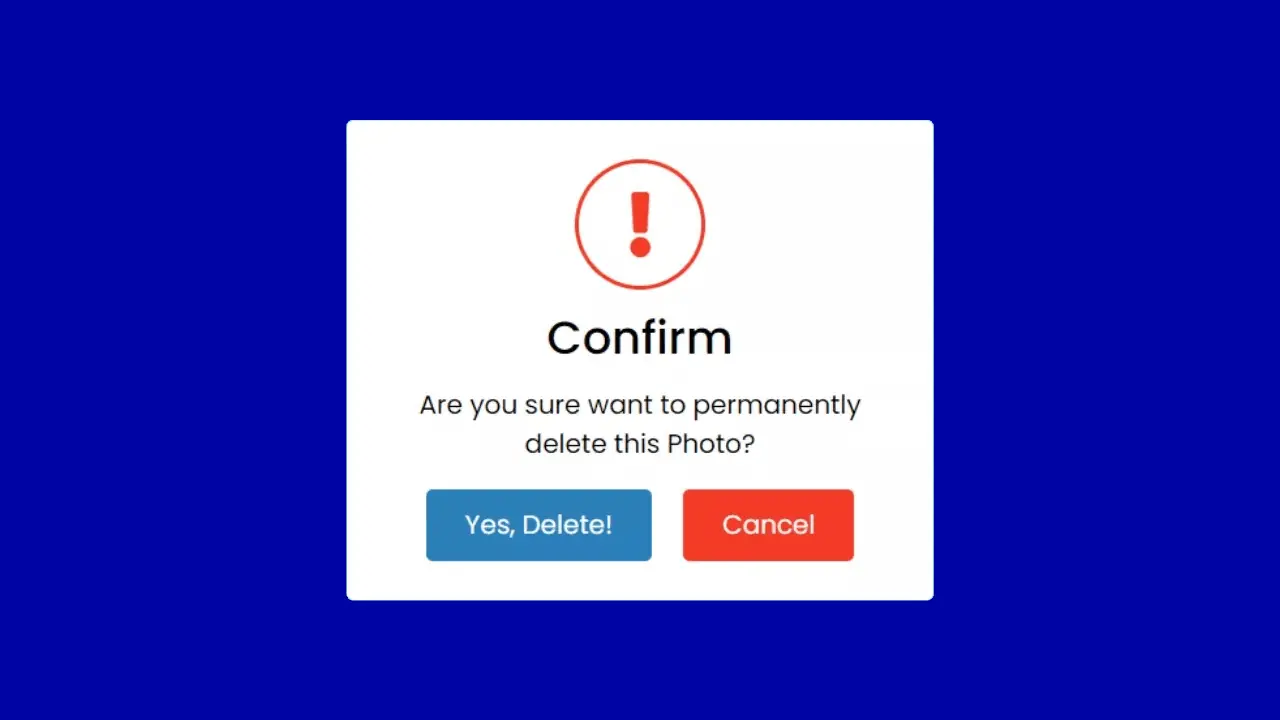
As you can see on the given image of alert box. It consists of a flat window with some text and two buttons.The text is used as a warning about the action and a two-box is used to ask the user’s opinion about the action. Users can cancel the action by clicking the “Cancel” button and continue the action by clicking the “Yes” button. Actually in the ID first there is a button with the text “Click Me” and the alert box is hidden, when you click on this “Click Me” button the alert box appears and the “Click Me” button disappears .
If you are finding it difficult to understand what I am talking about this program [animated alert box or custom popup box] then don’t worry I have created a complete video tutorial about this program which is given below. Has gone. I am sure all your confusion will be cleared after watching the complete video about this program [Custom Alert Box].
Custom Alert Box Code
To paste the given codes of this program , first, you need to create two files who one is an HTML file and second is a CSS file. After creating to these two files you can paste the given codes into your files. You can also download all source codes from the given website directly. It’s all your choice what you want to do.
					<!DOCTYPE html>
<html lang="en" dir="ltr">
  <head>
    <meta charset="UTF-8">
    <title>Alert Box | CodingLab </title>
    <link rel="stylesheet" href="style.css">
    <link rel="stylesheet" href="https://cdnjs.cloudflare.com/ajax/libs/font-awesome/5.15.2/css/all.min.css"/>
   </head>
<body>
    <div class="container">
      <input type="checkbox" id="check">
      <label class="show_button" for="check">Click Me</label>
      <div class="background"></div>
      <div class="alert_box">
        <div class="icon">
          <i class="fas fa-exclamation"></i>
        </div>
        <header>Confirm</header>
        <p>Are you sure want to permanently delete this Photo?</p>
        <div class="btns">
          <label for="check">Yes, Delete!</label>
          <label for="check">Cancel</label>
        </div>
      </div>
    </div>
</body>
</html>

<!-- Created By CodingTutorial - https://www.codingtutorials.in -->
					@import url('https://fonts.googleapis.com/css2?family=Poppins:wght@200;300;400;500;600;700&display=swap');
*{
  margin: 0;
  padding: 0;
  box-sizing: border-box;
  font-family: 'Poppins',sans-serif;
}
.alert_box,
.show_button{
  position: absolute;
  top: 50%;
  left: 50%;
  transform: translate(-50% , -50%);
}
.show_button{
  height: 55px;
  padding: 0 30px;
  font-size: 20px;
  font-weight: 400;
  cursor: pointer;
  outline: none;
  border: none;
  color: #fff;
  line-height: 55px;
  background: #2980b9;
  border-radius: 5px;
  transition: all 0.3s ease;
}
.show_button:hover{
  background: #2573a7;
}
.background{
  position: absolute;
  height: 100%;
  width: 100%;
  top: 0;
  left: 0;
  background: rgba(0, 0, 0, 0.5);
  opacity: 0;
  pointer-events: none;
  transition: all 0.3s ease;
}
.alert_box{
  padding: 30px;
  display: flex;
  background: #fff;
  flex-direction: column;
  align-items: center;
  text-align: center;
  max-width: 450px;
  width: 100%;
  border-radius: 5px;
  z-index: 5;
  opacity: 0;
  pointer-events: none;
  transform: translate(-50% , -50%) scale(0.97);
  transition: all 0.3s ease;
}
#check:checked ~ .alert_box{
  opacity: 1;
  pointer-events: auto;
  transform: translate(-50% , -50%) scale(1);
}
#check:checked ~ .background{
  opacity: 1;
  pointer-events: auto;
}
#check{
  display: none;
}
.alert_box .icon{
  height: 100px;
  width: 100px;
  color: #f23b26;
  border: 3px solid #f23b26;
  border-radius: 50%;
  line-height: 97px;
  font-size: 50px;
}
.alert_box header{
  font-size: 35px;
  font-weight: 500;
  margin: 10px 0;
}
.alert_box p{
  font-size: 20px;
}
.alert_box .btns{
  margin-top: 20px;
}
.btns label{
  display: inline-flex;
  height: 55px;
  padding: 0 30px;
  font-size: 20px;
  font-weight: 400;
  cursor: pointer;
  line-height: 55px;
  outline: none;
  margin: 0 10px;
  border: none;
  color: #fff;
  border-radius: 5px;
  transition: all 0.3s ease;
}
.btns label:first-child{
  background: #2980b9;
}
.btns label:first-child:hover{
  background: #2573a7;
}
.btns label:last-child{
  background: #f23b26;
}
.btns label:last-child:hover{
  background: #d9210d;
}