Draggable Circular Navigation Menu in HTML CSS & JavaScript
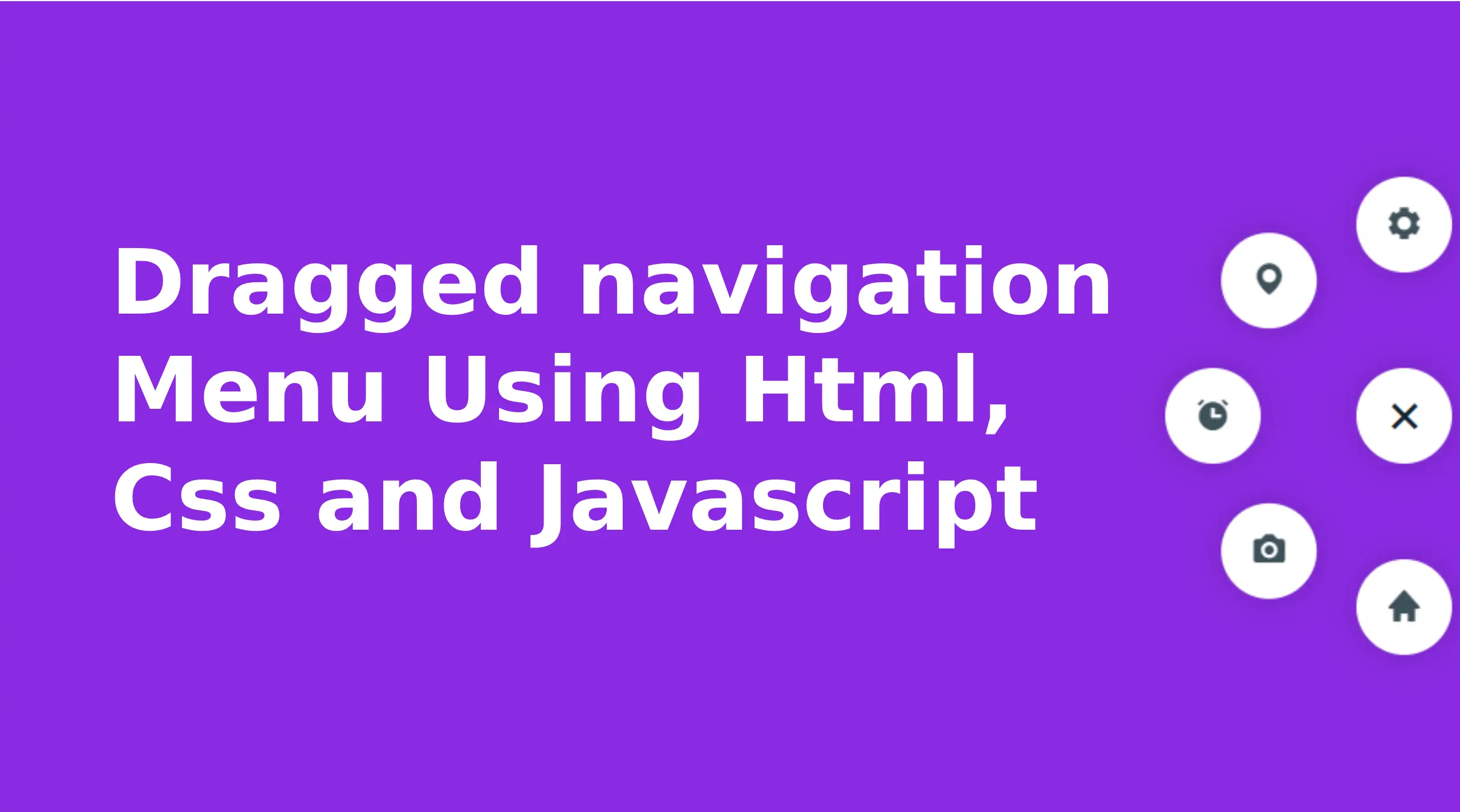
Draggable Circular Navigation Menu are a sleek and dynamic interface feature that can significantly improve the user experience on websites and apps. This interactive menu design integrates modern functionality with aesthetic appeal, providing users an intuitive way to navigate content. Let us look into the specifications of draggable navigation menu, its features, benefits and implementation details using the given HTML, CSS and JavaScript codes.
What is Draggable Circular Navigation Menu?
A draggable circular navigation menu is a movable, interactive menu that allows users to reposition it within the viewport using drag-and-drop gestures. Unlike traditional static menus, this feature introduces flexibility and customization, empowering users to customize the interface according to their preferences. This special menu design also includes animated icons and a toggle button to expand or collapse the menu, keeping the interface clutter-free.
Key Features of Provided Code Circular Navigation Menu
- Toggle Button for Menu Expansion:
The menu includes a circular toggle button with a plus icon (bx bx-plus), allowing users to expand or collapse the navigation options.
The toggle button rotates upon interaction, providing an intuitive visual cue.
- Circular Icon Design:
Each navigation option is represented as a circular button with an icon using the Boxicons library.
The icons rotate and change their position dynamically when the menu is opened.
- Draggable Behavior:
Users can click and drag the menu vertically on the screen.
Constraints ensure that the menu remains within the viewport, preventing it from disappearing off-screen.
- Responsive Animation:
Smooth transitions and animations enhance the overall aesthetic, making the menu visually appealing and engaging.
- Dynamic Styling:
The combination of CSS transformations, transitions, and hover effects creates a modern, polished interface.
HTML Structure
The HTML structure is concise and organizes the elements for a draggable circular navigation menu. Major components include:
- A
<nav>element that houses the entire navigation menu. - Individual
<span>tags for each menu item, wrapped within the.nav-contentcontainer. - A toggle button for expanding or collapsing the menu.
					<!DOCTYPE html>
<html lang="en">
<head>
  <meta charset="UTF-8">
  <meta name="viewport" content="width=device-width, initial-scale=1.0">
  <title> Draggable Navigation Menu</title>

  <!-- Boxicons CSS -->

</head>
<body>
  <nav>
    <div class="nav-content">
      <div class="toggle-btn">
        <i class='bx bx-plus'></i>
      </div>
      <span style="--i:1;">
        <a href="#"><i class='bx bxs-home'></i></a>
      </span>
      <span style="--i:2;">
        <a href="#"><i class='bx bxs-camera'></i></a>
      </span>
      <span style="--i:3;">
        <a href="#"><i class='bx bxs-alarm' ></i></a>
      </span>
      <span style="--i:4;">
        <a href="#"><i class='bx bxs-map' ></i></a>
      </span>
      <span style="--i:5;">
        <a href="#"><i class='bx bxs-cog' ></i></a>
      </span>
    </div>
  </nav>
 </body>
</html>
CSS Styling
The CSS defines the look and feel of the menu:
- The
bodybackground is styled in a vibrant blue-violet color, ensuring high contrast with the white navigation elements. - The
navelement is styled to be draggable withposition: absolute, allowing it to move vertically. - Circular buttons use
border-radius: 50%and shadows for a modern look. - The menu expansion is achieved with CSS transitions and custom
--iproperties for precise positioning of icons.
					 *{
  margin: 0;
  padding: 0;
  box-sizing: border-box;
}
body{
  height: 100vh;
  background: blueviolet;
  overflow: hidden;
}
nav{
  position: absolute;
  top: 20px;
  right: 0;
  width: 80px;
  height: 300px;
  display: flex;
  align-items: center;
  justify-content: center;
  cursor: grab;
}
nav .nav-content{
  display: flex;
  align-items: center;
  justify-content: center;
  transform: rotate(-45deg);
}
.nav-content .toggle-btn,
.nav-content span a{
  height: 60px;
  width: 60px;
  background: #fff;
  display: flex;
  align-items: center;
  justify-content: center;
  border-radius: 50%;
  box-shadow: 0 0 20px rgba(0,0,0,0.2);
}
.nav-content .toggle-btn{
  font-size: 35px;
  color: #0e2431;
  z-index: 100;
  cursor: pointer;
  transform: rotate(-225deg);
  transition: all 0.6s ease;
}
nav.open .toggle-btn{
  transform: rotate(0deg);
}
.nav-content span{
  position: absolute;
  transition: all 0.6s ease;
  opacity: 0;
}
nav.open .nav-content span{
  transform: rotate(calc(var(--i) * (360deg/8))) translateY(120px);
  opacity: 1;
}
.nav-content span a{
  text-decoration: none;
  transform: rotate(45deg);
}
.nav-content span a i{
  font-size: 24px;
  color: #0e2431;
  transform: rotate(calc(var(--i) * (360deg/ -8)));
  opacity: 0.8;
  transition: 0.2s;
}
.nav-content span a:hover i{
  opacity: 1;
}
JavaScript Functionality
The JavaScript code introduces interactivity:
- Toggle Functionality: A
clickevent listener toggles theopenclass on thenavelement, controlling the menu item’s expansion and animation. - Drag-and-Drop Interaction:
mousedown,mousemove, andmouseupevents track mouse movement and adjust thetopposition of thenav.- The
onDragfunction calculates the menu’s vertical position and ensures it stays within bounds usingwindow.innerHeightandnavHeight.
					// getting HTML elements
  const nav = document.querySelector("nav"),
        toggleBtn = nav.querySelector(".toggle-btn");

    toggleBtn.addEventListener("click" , () =>{
      nav.classList.toggle("open");
    });

  // js code to make draggable nav
  function onDrag({movementY}) { //movementY gets mouse vertical value
    const navStyle = window.getComputedStyle(nav), //getting all css style of nav
          navTop = parseInt(navStyle.top), // getting nav top value & convert it into string
          navHeight = parseInt(navStyle.height), // getting nav height value & convert it into string
          windHeight = window.innerHeight; // getting window height

    nav.style.top = navTop > 0 ? `${navTop + movementY}px` : "1px";
    if(navTop > windHeight - navHeight){
      nav.style.top = `${windHeight - navHeight}px`;
    }
  }

  //this function will call when user click mouse's button and  move mouse on nav
  nav.addEventListener("mousedown", () =>{
    nav.addEventListener("mousemove", onDrag);
  });

  //these function will call when user relase mouse button and leave mouse from nav
  nav.addEventListener("mouseup", () =>{
    nav.removeEventListener("mousemove", onDrag);
  });
  nav.addEventListener("mouseleave", () =>{
    nav.removeEventListener("mousemove", onDrag);
  });
Extending Functionality
For advanced features, consider:
- Mobile Responsiveness: Add touch event for drag functionality on touchscreen.
- Custom Themes: Allow users to switch between different color themes.
- Accessibility Features: Ensure keyboard navigation and ARIA roles for better inclusivity.
Conclusion
Draggable navigation menus are a versatile and user-centric design element that enriches the user experience by combining functionality with visual appeal. The provided implementation shows a robust approach to creating menus that provide flexibility, style, and interactivity. Whether for a portfolio site, web application, or creative project, this feature can elevate your design and leave a lasting impression on users.
Dragged Navigation Menu Source Code
Send download link to:

