How to Create a Responsive Owl Carousel in HTML | Step-by-Step Guide
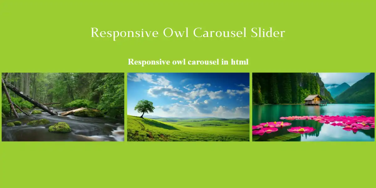
Owl Carousel is a powerful jQuery plugin that creates responsive and customizable sliders, ideal for enhancing the visual appeal of websites. Whether displaying images, videos or other content, it is a useful solution for web designers who want a dynamic way to display content. Here, we’ll explain how to implement the Owl Carousel, how to set up navigation, and how to achieve responsiveness across devices.
Step-by-Step Guide to Implementing Owl Carousel in HTML
HTML structure for the carousel: Start by setting up a simple HTML structure for the carousel. Wrap your carousel item (image, video, or text block) inside a div with a class of owl-carousel. Each item in the carousel must have the class Item:
					<div class="owl-carousel">
    <div class="item"><img decoding="async" src="data:image/svg+xml,%3Csvg%20xmlns='http://www.w3.org/2000/svg'%20viewBox='0%200%200%200'%3E%3C/svg%3E" alt="Slide 1" data-lazy-src="nature-images/1.webp"><noscript><img decoding="async" src="nature-images/1.webp" alt="Slide 1"></noscript></div>
    <div class="item"><img decoding="async" src="data:image/svg+xml,%3Csvg%20xmlns='http://www.w3.org/2000/svg'%20viewBox='0%200%200%200'%3E%3C/svg%3E" alt="Slide 2" data-lazy-src="nature-images/2.webp"><noscript><img decoding="async" src="nature-images/2.webp" alt="Slide 2"></noscript></div>
    <div class="item"><img decoding="async" src="data:image/svg+xml,%3Csvg%20xmlns='http://www.w3.org/2000/svg'%20viewBox='0%200%200%200'%3E%3C/svg%3E" alt="Slide 3" data-lazy-src="nature-images/3.webp"><noscript><img decoding="async" src="nature-images/3.webp" alt="Slide 3"></noscript></div>
</div>
Adding Owl Carousel styles and scripts: Link to Owl Carousel CSS and JavaScript files from the CDN for quick setup. Add jQuery first as it is required for the owl carousel:
					<script type="rocketlazyloadscript" data-minify="1" src="https://codingtutorials.in/wp-content/cache/min/1/ajax/libs/jquery/3.6.0/jquery.min.js?ver=1751093175" defer></script>


<script type="rocketlazyloadscript" data-minify="1" src="https://codingtutorials.in/wp-content/cache/min/1/ajax/libs/OwlCarousel2/2.3.4/owl.carousel.min.js?ver=1751093175" defer></script>
Customizing Carousel Navigation: Owl Carousel comes with built-in navigation arrows and pagination points. To customize navigation buttons, you can use CSS. This example styles buttons with a dark background, white text, and rounded corners:
					.owl-nav button {
    position: absolute;
    top: 50%;
    transform: translateY(-50%);
    background-color: #333;
    color: #fff;
    border: none;
    border-radius: 50%;
    width: 40px;
    height: 40px;
    font-size: 20px;
    cursor: pointer;
}
.owl-nav .owl-prev { left: -20px; }
.owl-nav .owl-next { right: -20px; }
Making the Carousel Responsive: Using media queries, you can adjust the size and position of navigation buttons for different screen sizes. For example:
					@media (max-width: 768px) {
    .owl-nav button {
        width: 30px;
        height: 30px;
        font-size: 16px;
    }
}
Carousel initialization: Finally, use JavaScript to initialize the carousel. You can configure properties like looping, autoplay, and responsiveness.
					$(document).ready(function(){
    $(".owl-carousel").owlCarousel({
        loop: true,
        margin: 10,
        nav: true,
        navText: ["‹", "›"],
        autoplay: true,
        autoplayTimeout: 3000,
        responsive: {
            0: { items: 1 },
            600: { items: 2 },
            1000: { items: 3 }
        }
    });
});
Key Features of Owl Carousel in HTML
- Responsive Layouts: Carousel seamlessly adapts to different screen sizes, providing a consistent user experience across desktops, tablets and smartphones.
- Customizable Navigation: You can add and style custom navigation buttons to make the carousel more intuitive.
- Autoplay and Looping: Set autoplay with a specific interval for automatic slides. Adding loop functionality ensures that the carousel content cycles smoothly.
- Hover Pause: Autoplay can be paused when a user hovers over the carousel, a feature that enhances usability by allowing users to focus on specific content without interference.
- RTL Support: Owl Carousel includes right-to-left (RTL) support, making it versatile for multilingual websites.
Benefits of Using Owl Carousel for Web Designers
Using Owl Carousel in HTML allows designers to create visually appealing and interactive elements that increase user engagement. Its responsive nature ensures that content remains accessible across all devices, while customizable features provide designers with flexibility. For developers, it is a lightweight solution that integrates easily into any web project, requiring minimal configuration.
Final Thoughts
Owl Carousel is an ideal choice for adding a slider to a website, especially if you want a quick, reliable, and customizable solution. With its extensive documentation and a wide range of customization options, it can transform the visual appeal of a website. Whether you’re displaying galleries, testimonials, or product demonstrations, implementing the Owl Carousel with the above steps will bring dynamic visual elements to your website.
Owl Carousel Source Code
Send download link to:

