How to Create Dynamic Bar Chart in JavaScript Library
In this blog post, we will break down the simple integration of data visualization using Plotly into a web page, along with some CSS styling to enhance the visual experience. Plotly is a powerful, open-source library for Bar Chart in JavaScript. that allows developers to create interactive, publication-quality graphs in JavaScript, Python, and other programming languages. This is how it works:
Loading the Plotly Library for create bar chart in JavaScript
To begin with, we load the Plotly JavaScript library using the following line:
<script type="rocketlazyloadscript" data-minify="1" src="https://codingtutorials.in/wp-content/cache/min/1/plotly-latest.min.js?ver=1751059636" defer></script>
It includes the latest version of Plotly, enabling you to use its vast functionality to create interactive plots including scatter plots, bar charts, line graphs and more. This CDN link is required to render Plotly graphs on your web page without installing anything on your server or machine.
Adding Background Styling in bar chart in JavaScript
position absolute places the div at a specific location on the page, with a top margin of 15%, therefore giving it some space from the top edge.
					body::before {
    content: "";
    position: fixed;
    top: 0;
    left: 0;
    width: 100%;
    height: 100%;
    background: url("images/nature-3082832_1280.jpg");
    background-size: cover;
    background-position: center;
    filter: blur(4px);
    z-index: -1;
}
.mydiv {
    width: 50%;
    height: auto;
    position: absolute;
    top: 15%;
    left: 25%;
}
Plotting the Data: Plotly Script
The most exciting part of this tutorial is where we integrate Plotly to generate a dynamic graph. The script below defines the data and uses Plotly to display a bar chart inside the div container we created:
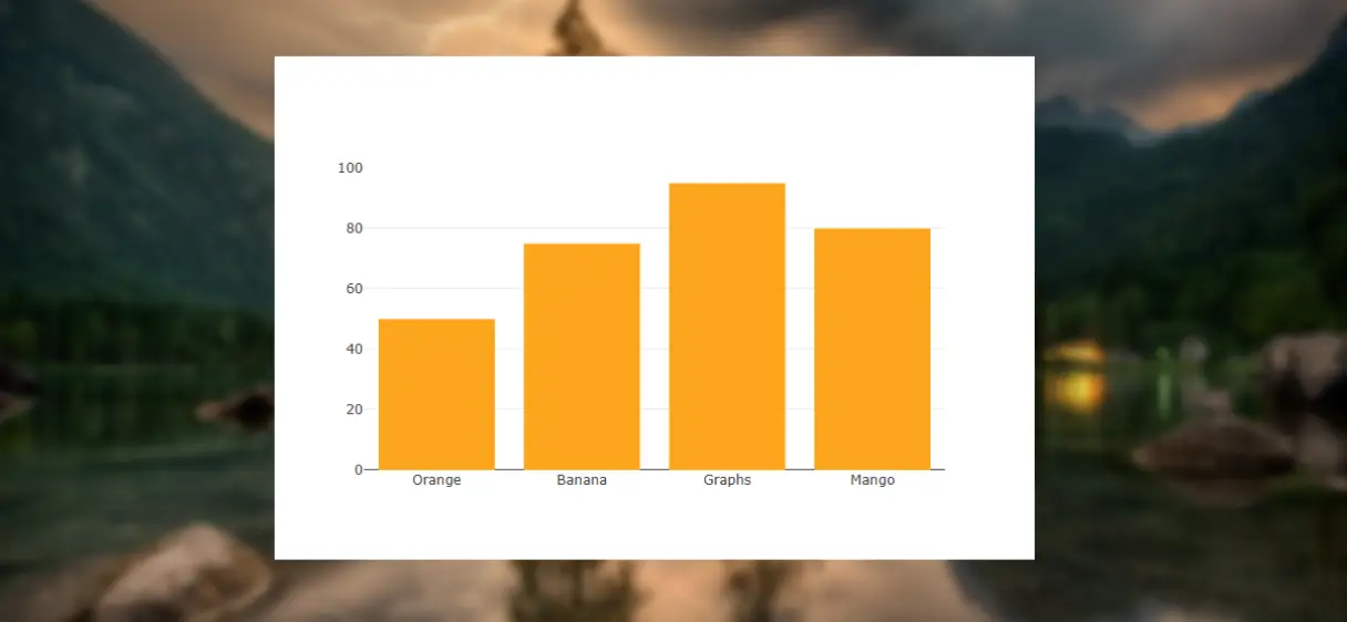
					    var x = ["Orange", "Banana", "Graphs", "Mango"];
    var y = [50, 75, 95, 80];
    var kumar = [{
       x: x,
       y: y,
       type: "bar",
       orientation: "v",
       marker: {color: "orange"}
    }];
    Plotly.newPlot("div1", kumar);
Here’s a breakdown of how it works:
- Data Definition: The
xarray holds the labels for each bar (fruits in this case), and theyarray holds the corresponding values (quantities, for example). - Plotly Configuration: The data for the bar chart is structured in a variable called
kumar. This includes the x-values, y-values, and a few other settings:type: "bar"specifies that we want to create a bar chart.orientation: "v"means the bars are oriented vertically.- The
markerproperty sets the color of the bars (orange in this case).
- Rendering the Plot: The
Plotly.newPlot("div1", kumar);function call tells Plotly to render the chart inside the HTML element with the IDdiv1(which is thedivdefined earlier).
Once the page loads, users will see a visually appealing background with a bar chart at the center displaying the quantities of different fruits. The graph is interactive, meaning you can hover over the bars to see specific data points, and you can zoom in or pan the graph as needed.
Conclusion
This example is just a starting point. Plotly offers a variety of customization options, including adding titles, adjusting axes, changing the graph type, or even integrating multiple graphs into one view. You can experiment with different chart types (for example, line graphs, pie charts), modify the styling, or even feed dynamic data into the chart through user input or the API.
By combining these techniques, you can create visually appealing, data-driven web pages that are engaging and informative for your users. Whether you’re creating dashboards, business intelligence tools, or simply adding data visualizations to your personal website, Plotly provides the flexibility and ease of use to get it done.
Download Source Code
Send download link to: