How to Creating a Responsive and Attractive Subscription Form?
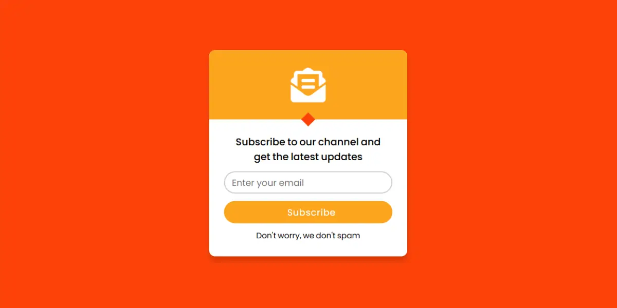
Creating a subscription form is a great way to keep your website visitors engaged and updated with the latest content. A well-designed form not only captures the visitor’s email but also enhances the overall look of the website, encouraging more subscriptions. This guide walks you through how to create an attractive subscription form using HTML and CSS, covering essential elements and styling tips.
Why a Subscription Form is Important
Subscription forms are essential tools for websites building email lists, sharing news or promoting special offers. They allow you to establish a direct line of communication with your audience, which is vital for business growth and engagement. Visitors who subscribe are more likely to return to your site, interact with the content, and ultimately become loyal customers or followers.
Steps to Create the Subscription Form
This tutorial focuses on HTML for structure and CSS for styling to make forms functional and visually appealing. Here are details of the structure and styling elements used in this form:
HTML Structure
					<!DOCTYPE html>
<html lang="en" >
  <head>
    <meta charset="UTF-8">
    <title> Subscription Form </title>
    <link rel="stylesheet" href="style.css">

     <meta name="viewport" content="width=device-width, initial-scale=1.0">
   </head>
<body>
  <div class="wrapper">
    <div class="top">
      <i class="fas fa-envelope-open-text"></i>
    </div>
    <div class="bottom">
      <div class="info">
        Subscribe to our channel and<br>get the latest updates
      </div>
      <form action="#">
        <div class="input-box">
          <input type="text" placeholder="Enter your email" required>
        </div>
        <div class="input-box">
          <input type="submit" value="Subscribe">
        </div>
      </form>
      <div class="footer">
        Don't worry, we don't spam
      </div>
    </div>
  </div>
</body>
</html>
The HTML file includes a simple yet effective structure for a subscription form. We start with a <!DOCTYPE html> declaration and a <html> tag with language set to “en” for English. Inside the <head>, there’s a meta tag for setting the character encoding to UTF-8, a link to a Google Fonts stylesheet, and another link to Font Awesome for adding icons.
- Inside the
<body>, we wrap the subscription form within adivwith the classwrapperfor styling purposes. Here’s a summary of key components: - Icon: The
fas fa-envelope-open-textFont Awesome icon adds visual appeal and helps users quickly identify the purpose of the form. - Message: An encouraging text (“Subscribe to our channel and get the latest updates”) motivates users to join the list.
- Input Fields: The form includes a text input for the email and a submit button.
- Footer Text: A reassuring note (“Don’t worry, we don’t spam”) to build trust with users.
CSS styling for attractive layouts
					@import url('https://fonts.googleapis.com/css2?family=Poppins:wght@200;300;400;500;600;700&display=swap');
*{
  margin: 0;
  padding: 0;
  box-sizing: border-box;
  font-family: 'Poppins',sans-serif;
}
html,body{
  height: 100vh;
  width: 100%;
  background:orangered;
}
.fa-envelope-open-text:before {
    content: "\f658";
    color: white;
}
.wrapper{
  position: absolute;
  left: 50%;
  top: 50%;
  transform: translate(-50% , -50%);
  background: #fff;
  width: 400px;
  border-radius: 12px;
  text-align: center;
  box-shadow: 0 10px 10px rgba(0, 0, 0, 0.15);
}
.wrapper .top{
  display: flex;
  justify-content: center;
  align-items: center;
  background: orange;
  height: 140px;
  position: relative;
  border-radius: 12px 12px 0 0;
}
.wrapper .top::before{
  position: absolute;
  content: "";
  height: 20px;
  width: 20px;
  background: orangered;
  bottom: -10px;
  transform: rotate(45deg);
}
.wrapper .top i{
  font-size: 70px;
  color: #ccc;
}
.wrapper .bottom{
  padding: 30px;
  word-spacing: -1px;
}
.wrapper .bottom .info{
  font-size: 20px;
  font-weight: 500;
}
.wrapper .bottom .input-box{
  height: 45px;
  margin: 15px 0 10px 0;
}
.wrapper form .input-box input{
  height: 100%;
  width: 100%;
  padding-left: 14px;
  outline: none;
  font-size: 18px;
  border-radius: 25px;
  transition: all 0.4s ease;

}
.wrapper .bottom input[type="text"]{
  border: 2px solid #ccc;
}
.wrapper .bottom input[type="text"]:focus,
.wrapper .bottom input[type="text"]:valid{
  border-color: #6665ee;
}
.wrapper .bottom input[type="submit"]{
  border: none;
  cursor: pointer;
  background: orange;
  color: #fff;
  letter-spacing: 1px;
}
.wrapper .bottom input[type="submit"]:hover{
  background: orangered;
}
.wrapper .bottom .footer{
  font-size: 16px;
  margin-top: 12px;
}
Using CSS, you can turn this form into an attractive, engaging element on the page. Here’s an overview of the styling used to achieve a professional look:
- Wrapper Positioning and Background: The wrapper is centered using
position: absolute;and CSS transformations. We set a background color and shadow to give it a lifted look. - Top Section Styling: A colored background with a rounded corner at the top gives a visually distinct space for the icon, helping to draw attention to the form.
- Input Field Styling: Text and submit fields are styled with padding, a smooth transition effect, and border-radius for a modern touch. The text input field changes color when focused, indicating interaction.
- Button Hover Effects: The submit button changes color on hover, creating an interactive experience for the user.
- Responsive Design: With a responsive design in mind, setting a
metaviewport tag ensures that the form scales correctly on mobile devices.
conclusion
Creating a subscription form in HTML and CSS is a straightforward process that adds value to your website. With this guide, you can implement a functional, stylish form that helps you connect with your audience. It not only looks professional but also works seamlessly on different devices. Adding a well-designed subscription form to your website can ultimately contribute to building a loyal following and improving your online engagement.
Subscription Form Source Code
Send download link to:

